
Screen Printing Ink Colors
Browse our standard ink palette and learn about Pantone color matching to ensure your prints look exactly as expected.
Color Accuracy Matters
Always verify the Pantone codes on your proof match your expectations before approving. Monitor settings can affect how colors appear on screen—the printed result will match the Pantone code, not your screen. On dark garments, bright colors will print a little brighter than they look on the proof because of the white underbase. Here's why.
Standard Ink Color Chart
5Boys Standard Ink Colors
54 stock colors organized by family — every swatch shows its Pantone code. Updated July 2026.
Core
Greys
Yellows & Golds
Oranges
Reds & Maroons
Pinks & Purples
Blues
Light Blues & Teals
Greens
Tans & Browns
Specialty
Most Popular Ink Colors
🔬 About Pantone Matching
We use the Pantone Matching System (PMS) to ensure consistent, accurate colors across all orders.
-
Exact Pantone matches — We mix inks to match your specified PMS codes
-
Free proofs — Review colors before we print
-
Custom colors available — Need a specific shade? Just ask
-
Specialty inks — Metallics, neons, puff, glow-in-dark on request
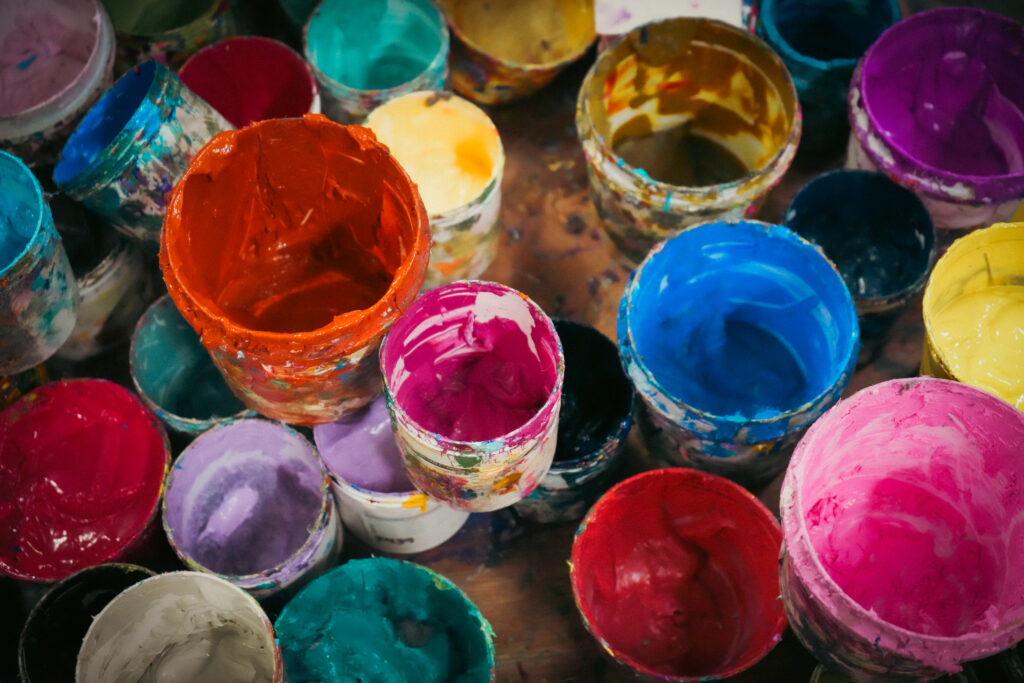
Professional Screen Printing
Our experienced team ensures vibrant, durable prints using high-quality plastisol inks that won't crack or fade.
Printing on Dark Garments: The Underbase
⚪ What's an Underbase?
Ink is semi-transparent. Print yellow straight onto a black shirt and the black shows through, so the yellow comes out dull and muddy. To prevent that, on dark and heathered garments we first print a layer of white ink — the underbase — and cure it, then print your colors on top. It works like priming a dark wall before painting it a bright color: your ink lands on white, so it shows at full strength.
-
No extra charge — The underbase is part of doing dark garments right. We don't count it as one of your ink colors.
-
Heathers count as dark — Sport Grey, Athletic Heather, and most heathered fabrics get an underbase too, even though they look lighter.
-
We handle it automatically — You don't need to set anything up. We decide which garment colors need it and build it into your print.
-
Light garments don't need one — On white and light shirts your ink prints directly on the fabric, and the proof is a very close match.
☀️ Why Your Print Looks Brighter Than the Proof
Your proof is a digital mockup: it lays your Pantone colors over a photo of the garment, so on a black or navy shirt the colors can look a little muted on screen. The finished print sits on a white underbase, so it comes out at full strength. Here's the same Athletic Gold (PMS 123) on a black shirt:
Colors that change the most: yellows, golds, oranges, light blues, pinks, lime, and light greys on black, navy, or heather garments. Dark inks like navy, maroon, and forest green look about the same either way.
That extra pop is the underbase doing its job, not a color change. The Pantone code on your proof is still exactly the ink we print. If a past order from another shop looks duller than ours, this is usually why — some printers skip the underbase or use a lighter halftone base.
Want the softer, vintage look on purpose? Just ask — we can print with a halftone underbase or no underbase for a distressed or tonal style, and we'll note it on your proof.
Need a Specific Pantone Color?
We can match virtually any Pantone color. Browse the full Pantone library to find the exact shade you need, then include the PMS code with your order.
💡 Good to Know
-
Monitor variance: Colors on screen may differ from printed results. Trust the Pantone code.
-
Shirt color affects ink: The same ink looks different on light vs dark garments.
-
Brighter than the proof: Dark shirts get a white underbase, so bright inks print more vivid than the on-screen mockup.
-
Exact hue not guaranteed: Due to screen printing variance, slight shade differences are normal.
-
Embroidery instead? Thread colors are a different palette — see our Thread Colors chart.
Questions About Ink Colors?
Our team can help you choose the perfect colors for your design and garment combination.